
—A Practical Breakdown of What Actually Drives Perceived Value and Conversion in Product Photography
By Daniel Hayes | Updated on April 15, 2026 | 🕓 9 min read
Key Highlights
- Why do product photos that look “good” still fail to convert?
- What signals make a product image feel cheap—even without technical flaws?
- What kind of images actually reduce buyer uncertainty?
- How many product photos are enough to drive conversions effectively?
- What details do online shoppers need to see before making a purchase?
- How can you create brand consistency without a professional studio?
You just finished shooting a set of product photos.
You set up the lighting, adjusted the colors, kept the background clean, and even fine-tuned the composition.
Then you place your images next to top-performing listings on Amazon or Shopify—and suddenly realize something:
Your photos look… cheap.

Not blurry. Not overexposed. Not obviously flawed in any technical sense.
But there’s a more subtle—and far more damaging—feeling:
They look like something “casually taken,” not something “worth trusting.”
You might even start questioning yourself:
I spent three hours on this—how is it worse than someone else’s quick phone shot?
The answer is simple—and counterintuitive:
The problem isn’t your gear. It’s a failure to communicate value.
And “looking good” has never been the same as “selling well.”
1. A Key Shift: Product Photos Aren’t for Display—They’re for Reducing Purchase Friction
1.1 Users Aren’t Looking at Photos—They’re Making Decisions
When a user scrolls to your product image, their brain completes three judgments in a fraction of a second (research from MIT suggests the brain processes visuals in as little as 13 milliseconds):
- Is this trustworthy?
- Is it worth the price?
- Will I regret buying this?
They won’t type these questions.
They answer them instantly through your image—and decide whether to keep scrolling or click.
This means:
Your product photo is replacing the in-store tactile experience.
In a physical store, customers can pick things up, feel textures, inspect details.
Online, all of that is compressed into a few static images.
If your photos fail to communicate tangible realism, the brain categorizes the product as “uncertain.”
And uncertainty leads to one thing: no purchase.
1.2 What Does “Cheap” Really Mean?
Cheap doesn’t mean low resolution.
Many at-home product shots have sharp detail, accurate colors, and clean composition—yet still feel “low value.”
The real issue is missing signals:
1. Lack of tactile realism
Users need to see texture, surface reflection, edge finishing.
Over-smoothing, over-whitening, and over-retouching erase these cues—making the product look like a plastic mockup.
2. Lack of contextual cues
A product floating on a pure white background gives no sense of scale, weight, or use.
No context = no imagination.
3. Lack of brand credibility signals
Inconsistent lighting, mismatched tones, distorted proportions—all subconsciously say:
“This was shot casually, not by a serious brand.”
A line worth remembering:
Cheap-looking photos don’t fail because they’re ugly—they fail because they don’t reduce uncertainty.
2. Why Your Product Photos Look Cheap: 5 Real Causes
Use this as a checklist against your own images.
2.1 Lighting Is Too Flat—No Depth, No Texture
This is the most common mistake in home setups.
Front-facing window light.
Ring light straight on.
Everything is evenly lit—no highlights, no shadows.
The product looks like a flat sticker pasted onto the background.
In reality, light defines volume.
Without contrast, you lose shape, material, and structure.

Fix:
l Move your light source to a 45-degree front-side angle
l Let light graze across the surface
l Create a natural highlight → midtone → shadow transition
If shadows are too dark, use a white card or foam board on the opposite side to bounce light back.
Aim for about a 3:1 light ratio—this creates sculptural depth.
At-home advantage? Imperfection.
Subtle window shadows, warm reflections from surfaces—these add realism.
Don’t chase perfect studio flatness.
That’s how your images start looking like stock inventory photos.
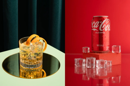
2.2 The Background Is Too Clean—And That Feels Cheap
Beginner assumption:
Pure white = premium = professional
Reality:
Over-sanitized backgrounds trigger suspicion.
Why? Because nothing in real life exists in a vacuum.
A product floating in perfect white, with no shadows or texture, feels artificial.
Users subconsciously question: Is this even real?
Fix: Add subtle environmental cues
l A hint of wood grain or linen texture
l A soft window shadow
l A partial object (coin, pen, tissue) as a scale anchor
Think of the background like a faint perfume—
present, but never overpowering.
2.3 No “Usage Logic”
Your product looks like a museum piece.
A cup standing upright.
A wallet fully opened.
A skincare bottle perfectly centered.
But users don’t know: How is this used?
This relates to Embodied Cognition—we understand objects by simulating interaction.
l A hand holding a cup → you imagine gripping it
l Lipstick extended → you imagine applying it
Without action cues, the product feels lifeless.

Fix: Add action signals
l Hands interacting naturally (not posing, but using)
l Half-used states (coffee partially filled, notebook opened)
l Signs of use (creases, folds, imperfections)
These “imperfections” create authenticity.
Users don’t see a product—they see a product being used.
2.4 You Didn’t Show the Details
This is a silent conversion killer.
Too many listings rely only on wide shots.
Users can’t inspect stitching, materials, or build quality.
Data shows:
l 42% of online shoppers rely on images for size judgment
l Products without detail shots have ~30% higher return rates
l 22% of returns happen because the product “doesn’t match expectations”
Often, it’s not deception—just lack of information.
Fix: Shoot three levels
1. Wide (Hero) – full product
2. Mid (Context) – product in environment
3. Close-up (Detail) – texture, seams, materials
Tip (mobile shooting):
l Avoid digital zoom
l Physically move closer (10–15 cm)
l Tap to focus, then reduce exposure
l Use side lighting to reveal texture
2.5 No Brand Consistency
Different lighting directions.
Different color tones.
Different aspect ratios.
Your storefront looks like five photographers worked on it.
Consistency = brand signal.
l Consistency → “This is a system”
l Inconsistency → “This is random”
And that perception directly affects willingness to pay.
Fix: Create a simple visual system
l Same light direction (e.g., always from the left)
l Same white balance
l Same aspect ratio (1:1 works best for mobile—63% of traffic)
l Same background complexity level
Pro tip:
Keep your best image saved on your phone.
Before each shoot, compare against it for alignment.
3. Why “Beautiful” Photos Still Don’t Convert
3.1 Aesthetic ≠ Informative
Many photographers prioritize:
Aesthetic > Information
But users want:
l What is it?
l How big is it?
l What’s it made of?
l How do I use it?
A visually stunning image that answers none of these = negative conversion impact.
Test yourself:
Look at your image as a stranger.
In 30 seconds, can you answer all four questions?
If not, it’s “beautiful but useless.”
3.2 You’re Shooting Art—Not a Sales Tool
This is the real divide.
l Photographers chase mood, light, composition
l Commercial images prioritize clarity, trust, action
They’re not opposites—but they have priorities.
Rule 1: Information clarity
Rule 2: Aesthetic quality
Every extra 10 minutes spent “making it look cooler” should be questioned:
Did this improve clarity?
If not—you’re making art, not driving sales.
4. A Practical Conversion Framework for Product Photography
4.1 The 5-Image Conversion Structure
You don’t need dozens of photos.
Just five, each solving a decision problem:
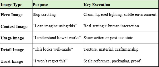
Each image answers a doubt. Together, they build momentum toward purchase.
4.2 Pre-Shoot Reverse Thinking Checklist
Before shooting, ask:
1. What is the user most worried about?
l Size? Material? Complexity?
2. Which image answers that concern?
l Size → Trust Image with scale
l Material → Detail Image with side lighting
3. What must be clearly visible?
l Not what you want to show
l What the user needs to verify
This shifts photography from art → problem-solving.
4.3 A Simple but Brutal Test
After shooting:
Open your platform (Amazon, Shopify, Etsy, etc.).
Find the top 3 listings in your category.
Place your image next to theirs.
Ask:
- Which looks more trustworthy?
- Which feels like a real brand?
- Which makes me want to click?
If the answer isn’t yours—you now know exactly what to fix.
FAQs
1. Is a pure white background always bad for product photography?
Not necessarily. It works well for marketplace compliance (e.g., Amazon main images), but relying on it exclusively can reduce perceived realism and trust.
2. How many photos should I include in a product listing?
A minimum of 5 well-structured images is often enough: hero, context, usage, detail, and trust images.
3. What’s the biggest mistake beginners make in product photography?
Focusing too much on aesthetics and not enough on information. If the image doesn’t answer user questions, it won’t convert.
4. Should I always include people or hands in product photos?
Not always, but adding human interaction often improves relatability and helps users imagine using the product.
5. How do I make my product photos look more “premium”?
Focus on texture, controlled lighting contrast, subtle environmental context, and visual consistency across all images.
References
1. Deng, L., & Poole, M. S. (2010). Affect in web interfaces: A study of the impacts of web page visual complexity and order. MIS Quarterly, 34(4), 711–730.
2. Jiang, Z., Chan, J., Tan, B. C., & Chua, W. S. (2010). Effects of interactivity on website involvement and purchase intention. Journal of the Association for Information Systems, 11(1), 34–59.
3. Kim, J., & Lennon, S. J. (2013). Effects of reputation and website quality on online consumers’ emotion, perceived risk, and purchase intention. Journal of Research in Interactive Marketing, 7(1), 33–56.
4. Orth, U. R., & Malkewitz, K. (2008). Holistic package design and consumer brand impressions. Journal of Marketing, 72(3), 64–81.
5. Tuch, A. N., Presslaber, E. E., Stöcklin, M., Opwis, K., & Bargas-Avila, J. A. (2012). The role of visual complexity and prototypicality regarding first impression of websites. International Journal of Human-Computer Studies, 70(11), 794–811.
About the Author
Daniel Hayes
Focus: Monetization Models, Platforms, Creative Income
Daniel Hayes explores different monetization paths in photography—from stock platforms and content licensing to online portfolios and creator economies. His work analyzes how photographers build income streams beyond traditional client work.
Editorial Transparency Statement
This article is based on hands-on industry experience in product photography and e-commerce optimization.
All frameworks, techniques, and recommendations reflect real-world application rather than theoretical assumptions.
No brands, tools, or platforms mentioned in this article are sponsored or affiliated unless explicitly stated.
Disclaimer
This content is for informational and educational purposes only.
Results in product photography and e-commerce conversion may vary depending on factors such as product category, target audience, pricing strategy, and platform algorithms.
Readers are encouraged to adapt the strategies presented here to their specific business context and test results independently.
Recommend:
Why Your Street Photos Feel Awkward—And How Zoom Lenses Quietly Ruin the Moment
When Clients Say “Too Expensive”—What They Really Mean (And How to Respond Without Lowering Your Price)

The Hidden Risk of Building a Photography Portfolio on Third-Party Platforms

No Contract, No Control: The Hidden Legal Risks in Photography Work